Pages

Saturday, April 2, 2011

Nick and Nora

Apparently it's been over two months since I posted anything on here. Oops. The Ely is over and done with. No more sweating over type placement and shards of glass. For anyone who hasn't seen my Ely pieces on my website or at the show, here you go:


And now for something completely different.
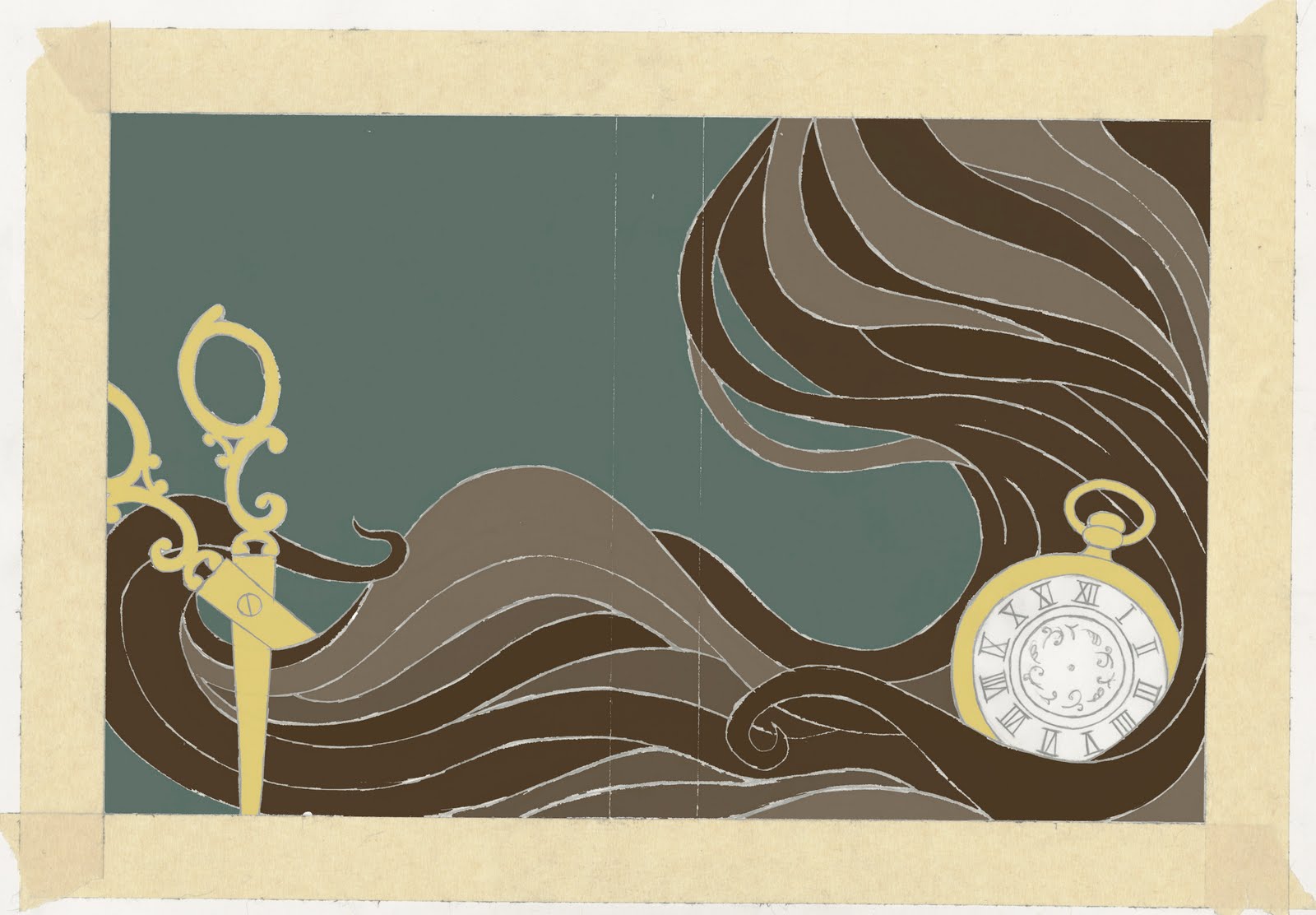
I recently (and by recently I mean within the past month) watched the movie The Thin Man and fell completely in love with it. I absolutely adore William Powell and Myrna Loy. They are amazing together. The actual story isn't completely spectacular but the writing and the humor is great and there's rarely a time when one of them doesn't have a drink in their hand. I enjoyed the movie so much that I decided to use it as the basis for one of my self assigned projects. This piece is a little different from the way I've been working. I decided to try using a pencil drawing instead of just the line drawing that i usually do in ink on newsprint. I think the results are different but good. The pencil drawing gave me a chance to put more detail into my drawings while still getting a rough textured look.


For anyone who doesn't know the story, it takes place in the mid 30's. Nick Charles (William Powell) is a retired detective, married to Nora (Myrna Loy) who's very rich. Even though Nick is retired he still takes on cases here and there and together they solve mysteries with their dog Asta.

Here's a video if anyone is interested. I highly recommend the series. So far I've only seen the first two movies but there are six altogether.


Also, you can see a very young Jimmy Stewart in the second movie (After the Thin Man) which makes it totally worth watching.

Thursday, January 20, 2011

i'll make this short, maybe not.

Quick update. I re-did the Ely Poster. Or rather, i revised it. Fixed some of the lettering, brought out the texture more and fixed the hands to make them a little more feminine and less like amorphous blobby things. Also changed the coloring a little. Not sure if thats for the better or worse. You can decide that for yourself.


Next is something i finished a while ago but haven't gotten around to posting. You know how artists are, so scatterbrained. This is the first Ely piece that I did. The O. Henry book cover. I'm extremely happy with it and thats probably the last time anyone will ever hear me say that about one of my pieces. The Dorothy Parker book cover on the other hand... well It's been a struggle to say the least. anyway, here it is

I'm incredibly pleased with how this turned out and I wish I could say the other pieces are coming together just as well. Hopefully this weekend I can get them all sorted out and have something new to post.

Heres a link to a short story by O. Henry. Everyone (or most people) know the story of "The Gift of the Magi" which my cover is based on so instead I thought I leave a link to my favorite O. Henry story.

http://www.literaturecollection.com/a/o_henry/38/

I'm constantly amazed by the endings to his stories and this one gave me hope that there is such a thing as destiny. (as cheesy as that may sound)

Thursday, January 13, 2011

update

I meant to update this thing the first week of winter break but i forgot/put it off and now its the last week of winter break so I might as well get on that. Heres a few things i did but never got around to posting. Brace yourself, its kind of long.


^^ this one is an album cover for Badly Drawn Boy. Its not so much of a band as it is a stage name. Damon Gough is Badly Drawn Boy. My idea for the design came from the album title as well as the band/stage name. The technique (style?) that I use seemed to fit well with the idea of being "Badly Drawn" which is what I focused on. Dividing it into three sections contributed to that as well as the title of the Album "One Plus One is One"

heres two of my favorite songs from the album incase anyone is curious.


The next piece is an album cover for The Pernice Brothers called "Live A Little".

I'm not particularly satisfied with it. If I had the time I'd change the lettering and the colors a bit. This one was kind of rushed. The lettering looks too much like something on a 60's poster for The Doors rather than an album cover for some indie band from the 90's. I was hoping the colors would be enough to get away from the 60's but in the end all I see is peace signs, bell bottoms and big lapels. Lesson Learned. The idea for the design came from the first track on the album called "Automaton" and the background was inspired by the lead singers voice. The way he sings is very breathy almost likes he's gasping for air but in a less dramatic way. I wanted it to look almost like wind.

heres a song from the album. excuse the video. i'm not sure if this is the actual music video or what it even has to do with the
song.


and last but not least here is the poster that I designed for the Senior Thesis Show. Keep in mind it needs revising. there'ss a bunch of things i intend to fix so for now this is just a rough piece.


When I got this assignment I had a lot of trouble coming up with an idea. The teachers told us not to draw any art supplies or any images of people painting or drawing because it was too obvious and they want us to think outside the box. I tried thinking about what the Ely means to all of us. It's a rite of passage, it shows how much we've grown in the past 4 years, by this point we are all a bunch of art making machines. Then i realized that the Ely is when we put all of our work on display. We expose ourselves. So there it is. A woman exposing herself. At first I was afraid that it wasn't a good idea because when people see a poster of a woman in an open trench coat they won't think "Art Show" But Tim said it didn't matter. The point is that it grabs peoples attention and as long as it doesn't look cheap or trashy then its fine. I made sure this anonymous woman looks classy.

Sunday, December 5, 2010

Everyman, I will go with thee...

Hey guys,

So I know I should be updating this with some of the work I've done recently, like the finished O. Henry cover or the album covers I just did, but right now I really just want to share what I found at the library sale I went to today. I figured it was a good place to find books to display my book jackets on for the Senior Thesis show. Title and content aren't important, its really just the size and shape of the book that matters and I found what I was looking for which is great, but I also wandered around a bit and found another book that was really cool. "The Poetical Works of John Milton." It was in a section called old/odd books. I only picked it up because it looked old and I guess I just like old things. Jewelry, men, cars, etc. I flipped the cover open to the endpapers and practically fell in love. The design is just beautiful.


I'm a sucker for decorative line work and as a bonus it has a name written in it. There's something really cool about finding a book that belonged to another person. It makes me wonder what they were like, whether they enjoyed the book, whether they're even still alive... This book belonged to Isadore H. Boorstein of Cornell '20. I assume since this person graduated in 1920 theres a good chance they are no longer living. I googled Isadore a little bit (because I'm totally creepy) and unfortunately all i found was that they went to Cornell. (go figure) Anyway, there was also a kind of title page in the book that was just as gorgeous as the endpapers.


There is no Illustrator listed anywhere so I can't look them up and find any more of their work but all the same it's still a really cool book to have and I might even read it. I just hope it doesn't fall apart since it's pretty old.


Oh and If you want to freak people out in a library or a book store, take a measuring tape with you and start measuring books. You'll get all kinds of weird looks. Nobody asked me what I was doing so I didn't bother explaining that I need books of the same size for my senior thesis show. I can't even imagine what they thought I was doing.

I'll try to have another post up soon. For now, enjoy!

-Pheebs.

Sunday, November 14, 2010

What's a good name for a 2nd blog post?

I probably shouldn't post this until it's completely finished but I'm doing it anyway. This is what I have so far on the first piece of my Senior Thesis.


Its missing most of the text and I haven't included the dust jacket flaps yet. I mostly worked on the image because thats all i had time for. The only time the printing lab would let me come in was Friday because they were filled for Monday so I had to do as much as I could Thursday night. (I know, excuses, excuses) But aside from the missing pieces I'm actually pretty happy with what I've got so far. I'm glad Ralph talked me out of using gold foil on the watch. I think it might have looked too gaudy. I'm still getting the hang of this style i've been working in so sometimes it's hard to judge what would look good or bad. I was so afraid that once I colored this in it would look terrible. I've tried to stop thinking like a painter though and that has helped quite a bit. It's funny how that works. As a painter i did my line drawings and then everything else could be shaded with paint to give it depth but working like this there is not gradation or shading so I have to focus more on shapes. Another thing I was kind of afraid of was that the cover wouldn't work by itself without the rest of the hair and the scissors. The whole image is a wrap around cover so it goes from front to back. But I tried to make sure everything I was doing on the right side could work well alone. I think it was successful. Of course I can never be too sure since I'll always be harder on myself than anyone else but at least I hope it's successful.


When I started this I planned on doing hand drawn text but I haven't put it on yet so please forgive the weird text I used.

Well anyway this is what I've got so far. Enjoy. and if anyone has any constructive criticism please share. I'll be hearing it from Ralph and others on Tuesday but I'd love to hear from anyone else who has something to say. And it would be nice to know that I'm not writing to an imaginary audience.

Thursday, November 11, 2010

First Post

So I've tried writing on this thing numerous times and every time i end up quitting half way through because i can't think of anything good to say. But since the Elys (Senior Thesis for you non-Uarts kids) started i figure this is a good way to share my work and my process. These are some color studies for my first piece. It's a book cover for Short Stories by O. Henry. The image is based on his most popular story "The Gift of the Magi" I'm working on the finish now. I told Ralph (my teacher) I liked the green better but I changed my mind and decided to go with the blue. The colors aren't exact. They're all going to change a bit in the final piece. This is just kind of a general idea of what colors go where. There's also a few things missing including the text, but like i said it will change for the finish.


I feel like blue fits the mood of the story better. Its kind of a sad story but in the end its also kind of happy depending on how you look at it. I'm pretty sure O. Henry intended for it to be happy. If you haven't read it I highly recommend it. I'm a huge fan of O. Henry. The Gift of the Magi was the first one of his stories I ever read way back in 7th grade. (I thank Mrs. Brubaker for that)

When I started the Ely's I really wanted to do 4 covers all for O. Henry stories but I realized it wouldn't make much sense to do a book cover for a story that's only couple pages long so I decided to do one that was recognizable for a collection of his work. In the end the theme of my Ely is Authors of short storys. Next up is Dubliners by James Joyce, The Portable Dorothy Parker by Dorothy Parker (which also includes her poetry, reviews and letters to friends) and Nine Stories by J. D. Salinger.

And while we're on the subject of books I'll leave you with a link to this wonderful blog I found today.
http://bookshelves.tumblr.com/