Pages

Sunday, November 14, 2010

What's a good name for a 2nd blog post?

I probably shouldn't post this until it's completely finished but I'm doing it anyway. This is what I have so far on the first piece of my Senior Thesis.


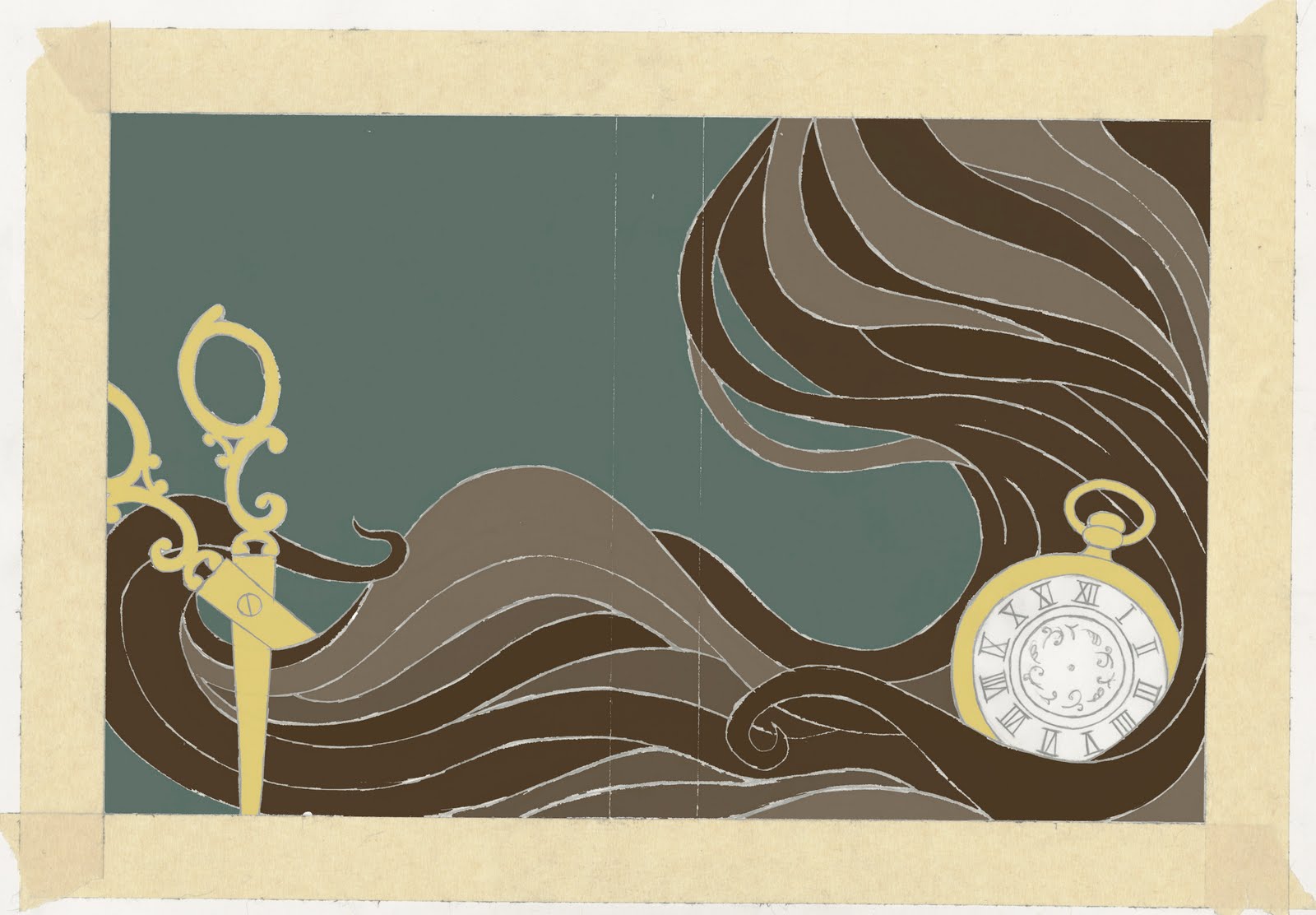
Its missing most of the text and I haven't included the dust jacket flaps yet. I mostly worked on the image because thats all i had time for. The only time the printing lab would let me come in was Friday because they were filled for Monday so I had to do as much as I could Thursday night. (I know, excuses, excuses) But aside from the missing pieces I'm actually pretty happy with what I've got so far. I'm glad Ralph talked me out of using gold foil on the watch. I think it might have looked too gaudy. I'm still getting the hang of this style i've been working in so sometimes it's hard to judge what would look good or bad. I was so afraid that once I colored this in it would look terrible. I've tried to stop thinking like a painter though and that has helped quite a bit. It's funny how that works. As a painter i did my line drawings and then everything else could be shaded with paint to give it depth but working like this there is not gradation or shading so I have to focus more on shapes. Another thing I was kind of afraid of was that the cover wouldn't work by itself without the rest of the hair and the scissors. The whole image is a wrap around cover so it goes from front to back. But I tried to make sure everything I was doing on the right side could work well alone. I think it was successful. Of course I can never be too sure since I'll always be harder on myself than anyone else but at least I hope it's successful.


When I started this I planned on doing hand drawn text but I haven't put it on yet so please forgive the weird text I used.

Well anyway this is what I've got so far. Enjoy. and if anyone has any constructive criticism please share. I'll be hearing it from Ralph and others on Tuesday but I'd love to hear from anyone else who has something to say. And it would be nice to know that I'm not writing to an imaginary audience.

Thursday, November 11, 2010

First Post

So I've tried writing on this thing numerous times and every time i end up quitting half way through because i can't think of anything good to say. But since the Elys (Senior Thesis for you non-Uarts kids) started i figure this is a good way to share my work and my process. These are some color studies for my first piece. It's a book cover for Short Stories by O. Henry. The image is based on his most popular story "The Gift of the Magi" I'm working on the finish now. I told Ralph (my teacher) I liked the green better but I changed my mind and decided to go with the blue. The colors aren't exact. They're all going to change a bit in the final piece. This is just kind of a general idea of what colors go where. There's also a few things missing including the text, but like i said it will change for the finish.


I feel like blue fits the mood of the story better. Its kind of a sad story but in the end its also kind of happy depending on how you look at it. I'm pretty sure O. Henry intended for it to be happy. If you haven't read it I highly recommend it. I'm a huge fan of O. Henry. The Gift of the Magi was the first one of his stories I ever read way back in 7th grade. (I thank Mrs. Brubaker for that)

When I started the Ely's I really wanted to do 4 covers all for O. Henry stories but I realized it wouldn't make much sense to do a book cover for a story that's only couple pages long so I decided to do one that was recognizable for a collection of his work. In the end the theme of my Ely is Authors of short storys. Next up is Dubliners by James Joyce, The Portable Dorothy Parker by Dorothy Parker (which also includes her poetry, reviews and letters to friends) and Nine Stories by J. D. Salinger.

And while we're on the subject of books I'll leave you with a link to this wonderful blog I found today.
http://bookshelves.tumblr.com/